律所要闻 / 條目
Website relaunch: If you snooze, you lose
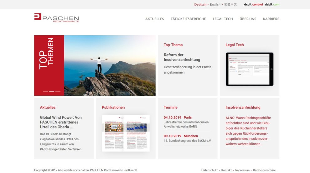
Being a pioneer in digital workflows, IT technology plays an outstanding role at PASCHEN. To ensure that our online presence also meets this requirement, it was comprehensively updated. The new site impresses with responsive design, a fresh look and clear colours.
The main focus of our relaunch was on improving usability. In addition to a more modern layout, the site can now also score with mobile use. It adapts to all screen sizes and is also very easy to navigate on smartphones and tablets.
The homepage was completely revised, too. A top topics slider dominates the page; next to it you can find the latest news and upcoming events which are displayed clearly and reduced to the essentials in a modern tile layout. Large-sized image tiles and redesigned, partly new added menu items guide you to individual subject areas.
Submenu are now equipped with a drop-down-box, so that you do not have to scroll long to get the information that is of your interest. In addition, you can now browse through our office brochure interactively.
We hope you like our new “outfit” as much as we do and look forward to getting your feedback.


